
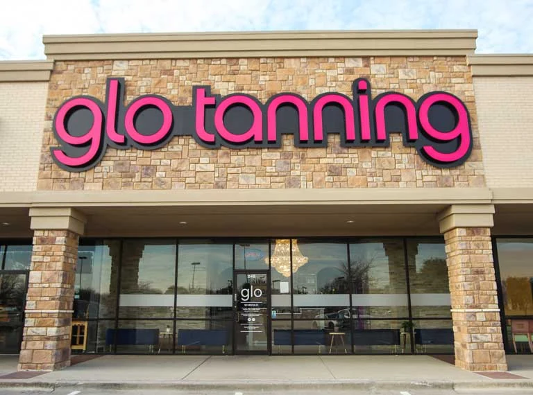
Pink GLO Tanning lettering centered on a stone commercial storefront.
- Brand
- GLO Tanning
- Application
- Exterior identity
- Setting
- Commercial storefronts
- Signage partner
- Blackline Sign Company
Distinctive by design.
Recognizable at a glance.
Blackline completed the storefront signage shown for GLO Tanning. These exterior views pair the same recognizable lettering with two material palettes: light stone and dark brick with warm wood accents. They illustrate why a sign should be considered in the context of the whole façade.
A consistent signature
The pink letterforms establish a recognizable focal point in both settings.
Responsive to the building
Different façades call for attention to placement, scale, and the available sign area.
One identity, multiple settings
The gallery is a useful starting point for a conversation about repeatable brand standards.
Different views.
The same identity.
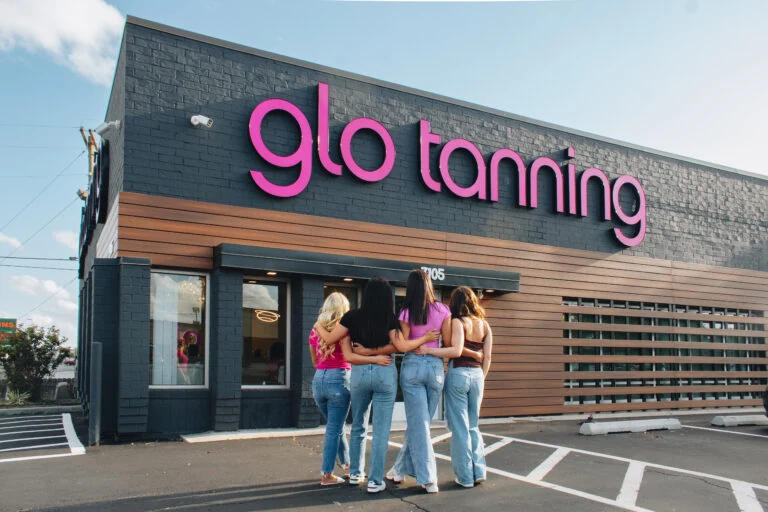
Project photographs show the visible design. Materials, illumination, installation methods, and other technical specifications are confirmed separately for each new project.
Planning signs for more than one location?
One location or a national rollout. Start with a conversation.